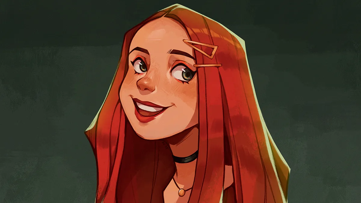
"It’s about finding the balance": A day in the life of visual development artist Chrystin Garland By ImagineFX staff published 13 April 24 A day in the life The artist fills us in on her daily spree of creative endeavours, from painting to creating cosplay costumes.
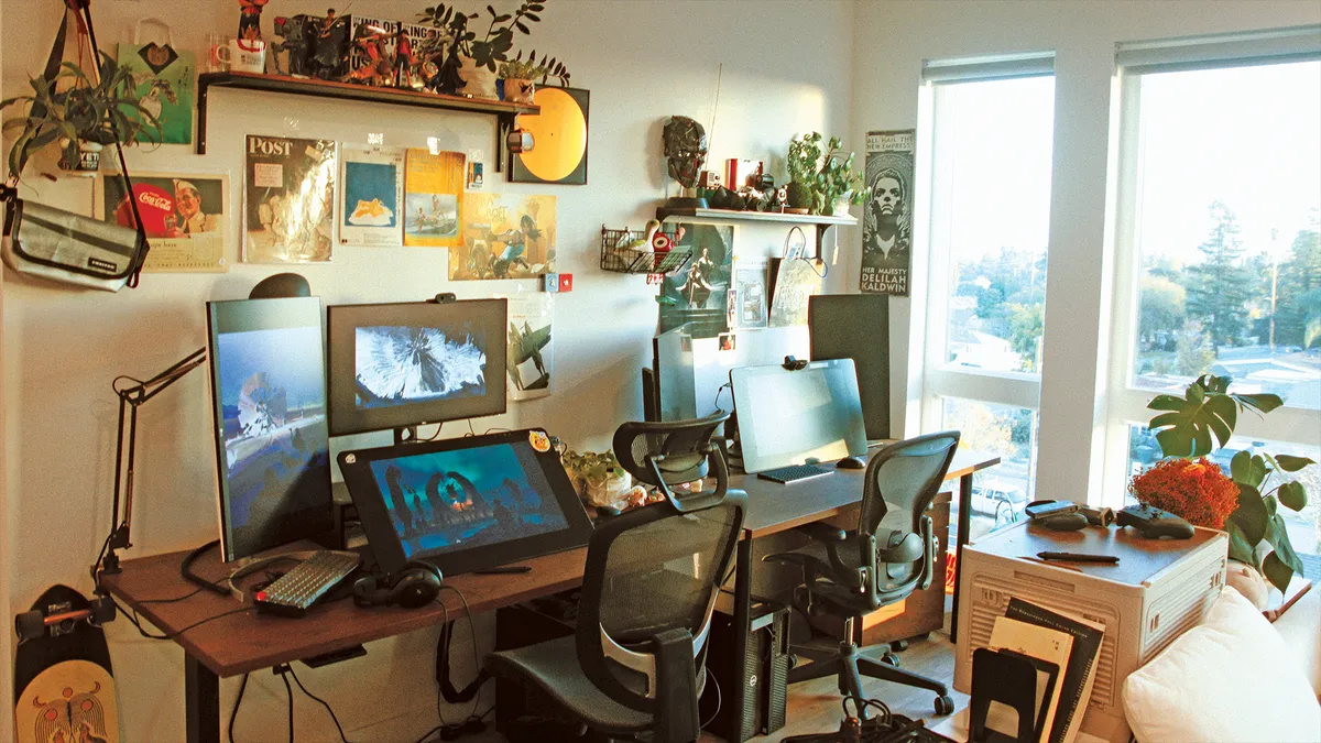
Artist in residence: Concept artists Boyuan Ryan Shi and Xiaoxue Snowy Zhang By ImagineFX staff published 23 March 24 magcontent The artists invite us into their studio to explore a trove of treasures from an antique typewriter to old school cameras.
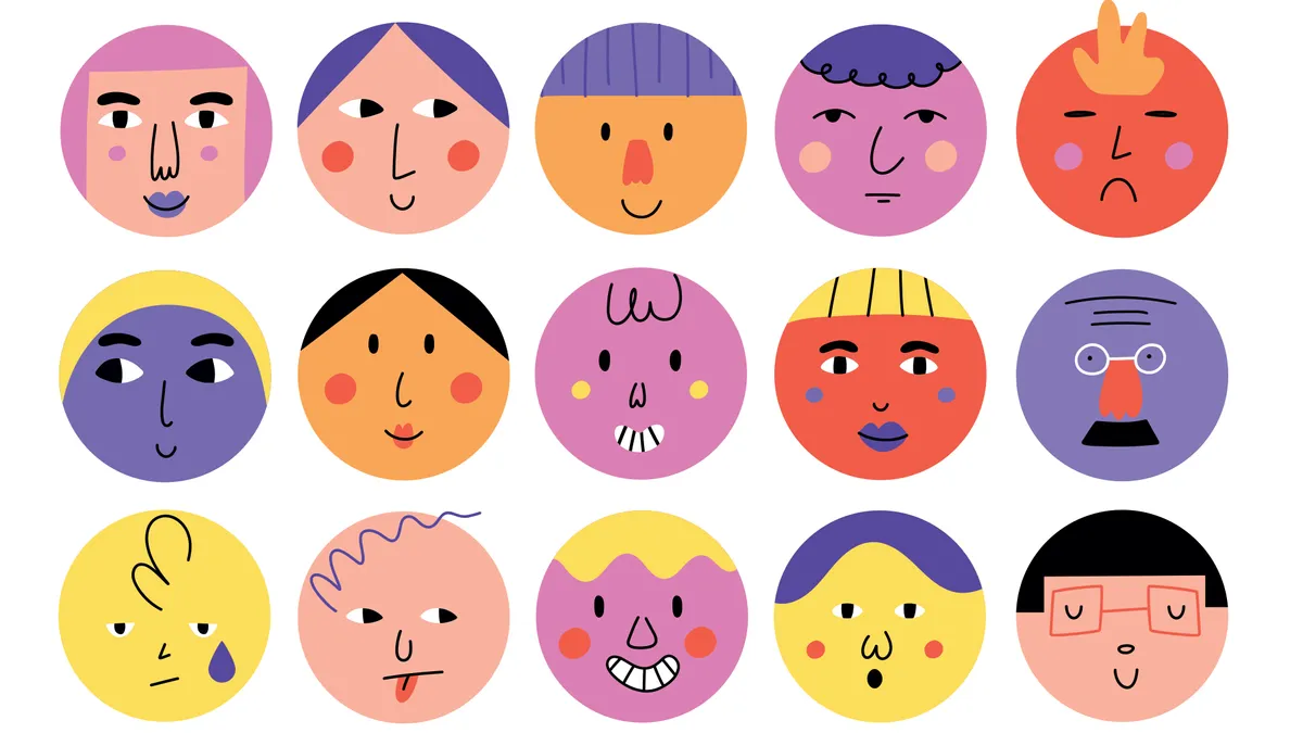
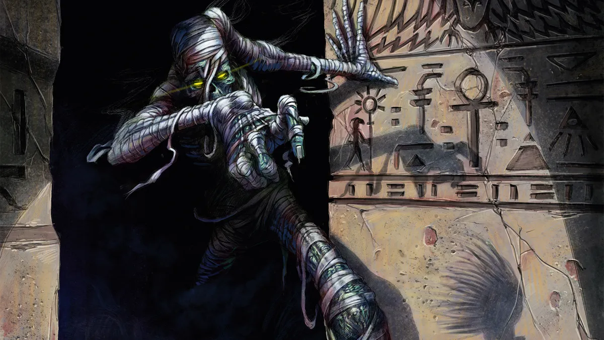
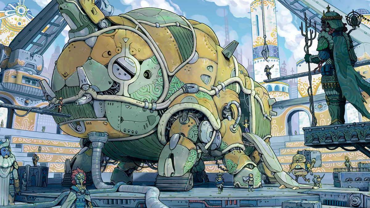
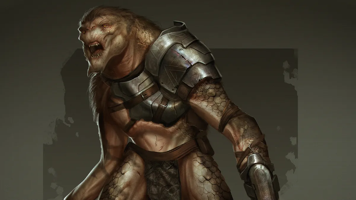
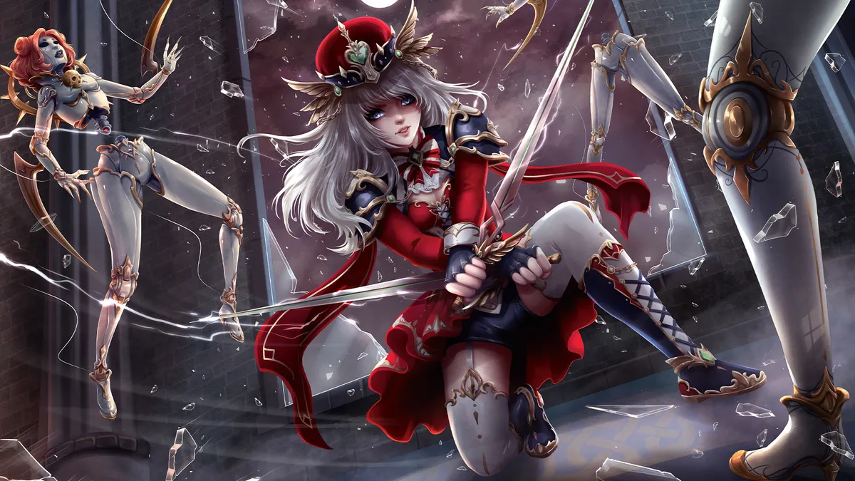
33 expert character design tips By Rosie Hilder last updated 21 March 24 Character design Leading artists and illustrators share their character design tips.
ImagineFX Art Challenge! Enter for a chance to be featured By Rob Redman published 18 March 24 Digital Art Find out how you could get your art in ImagineFX by taking part in our first Art Challenge, based on the theme Fantasy Book Illustration.
How to design engaging book cover art By Tony DiTerlizzi published 16 March 24 magcontent The author and illustrator of The Search for WondLa refreshes his book cover to celebrate its upcoming TV adaptation.
Find your tribe at Vertex By Tanya Combrinck published 10 March 24 News Join us to connect and learn at the ultimate festival of digital art, animation and VFX.
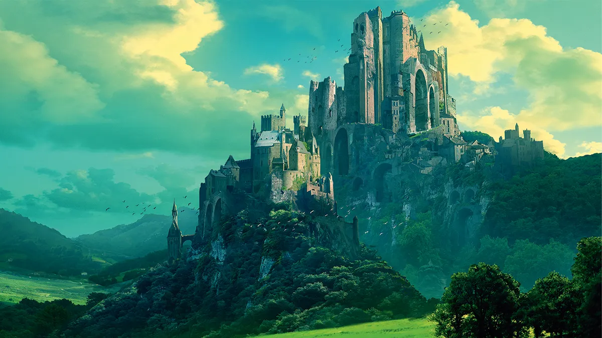
17 digital artists you need to know about By Claire Howlett published 3 March 24 Inspiration These incredible digital artists will inspire you.
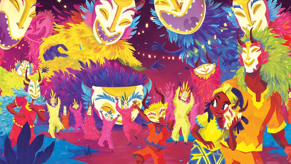
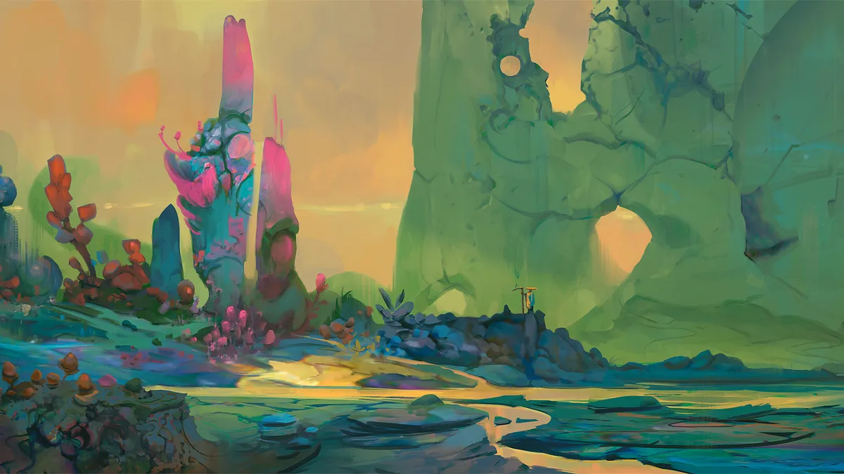
4 tech trends that are influencing digital art in 2024 By Tanya Combrinck published 3 March 24 magcontent How technology has sparked a demand for human connection, nostalgia, and visuals that make the digital tangible.
Should I work in the games industry? By Tanya Combrinck published 2 March 24 Gaming Four industry veterans talk about the rewards and challenges of pursuing an art career in the world of video games.
How to create a fantasy beast By Brynn Metheney last updated 15 February 24 Fantasy Artist Brynn Metheney reveals her process for creating fantastical creatures
18 essential watercolour techniques for every artist By Brynn Metheney last updated 15 February 24 Art Our must-know watercolour techniques will help you elevate your skills.
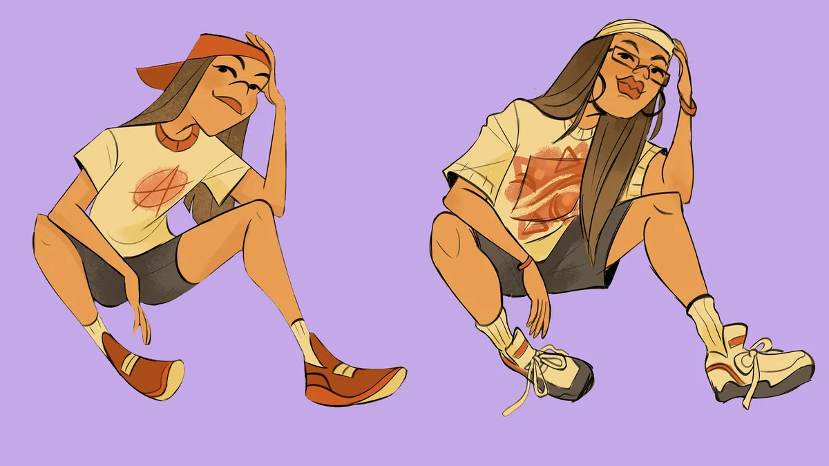
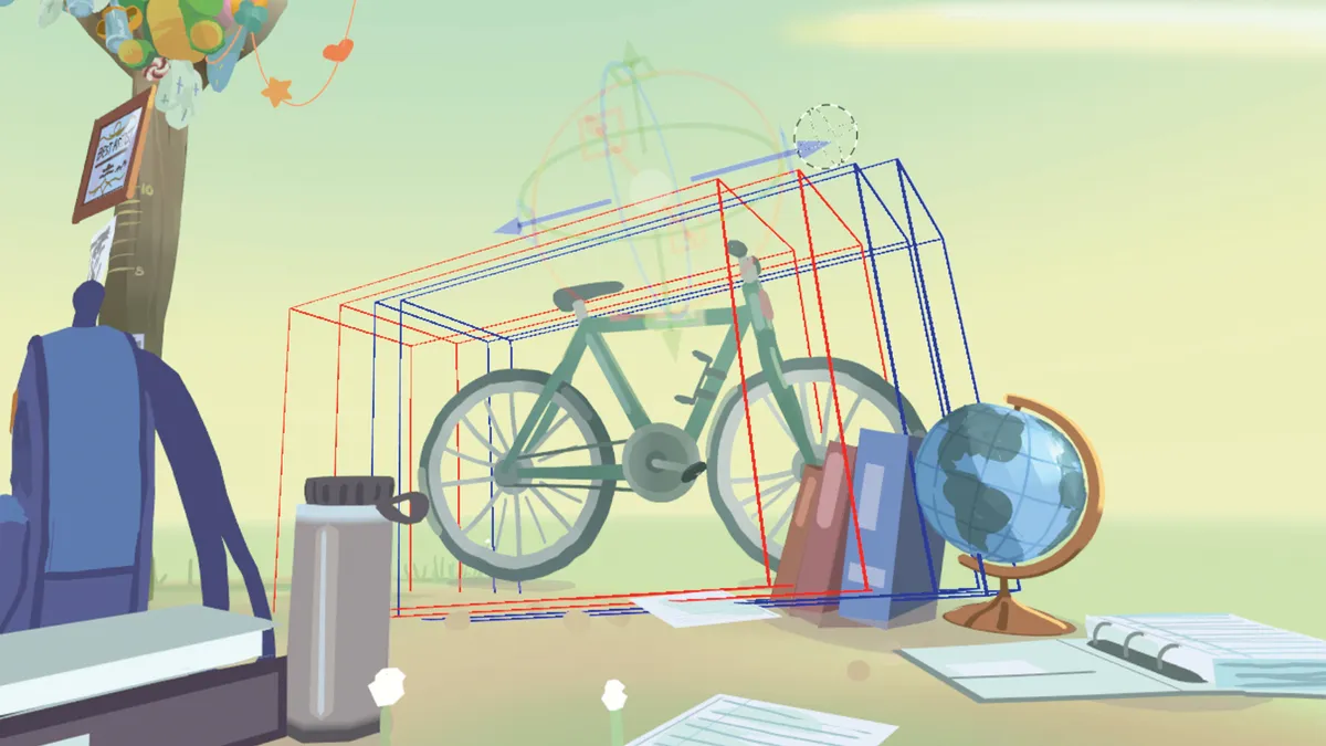
How to simplify figures for animation By Jackie Droujko published 28 January 24 Digital Art The process behind creating simple yet appealing characters for animation.
10 tips to get started in Quill for VR artists By Dan Franke published 27 January 24 Tutorial How to master sketching, storyboarding and painting an animation project in VR
How to build dramatic light in Krita By Toby Willsmer published 21 January 24 Tutorial Top techniques for creating standout lighting and shadows in your illustrations.
How to create key art for video games in Photoshop and Blender By Adrien Cantone published 20 January 24 Tutorial The process behind designing the keyframe art for sci-fi strategy game Trailblazers.
How to flesh out your creature art using Photoshop By Kyle Brown published 14 January 24 Tutorial Use this Photoshop workflow to add weapons, props and more to your characters.
How to create dynamic action scenes in Clip Studio Paint By Jolene Yeo published 13 January 24 Digital Art Setting up action scenes – from finding a pose to adding excitement with elemental effects.
How to add pop to your character art By Alix Harris published 31 December 23 Tutorial A step-by-step guide to creating vibrant portraits that provide personality for your characters.
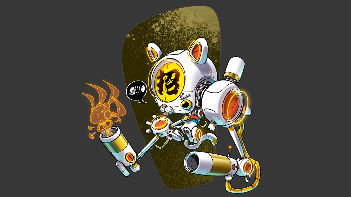
How to design a stylised Japanese cyborg in Procreate By DaCosta Bayley published 5 November 23 magcontent A step-by-step guide on how to recreate a well-known cultural figure as a futuristic feline character.
20 of the best horror artists for Halloween inspiration By Alice Pattillo last updated 31 October 23 Illustration These creative horror artists have the dark, gruesome and horrifying nailed.